If you’ve been reading our blog for a while, you probably know that the two most important aspects of a successful postcard campaign are:
- The quality of your mailing list
- The quantity of your mailings
But one other aspect runs a very close third. It can make the difference between a mildly successful campaign and a WILDLY successful campaign.
After delivering more than 71,200 postcard marketing campaigns — and tracking results — I can tell you without a doubt that design matters!
In fact, show me a postcard that didn’t perform well and I can pretty much always tell you why.
Of course… I want EVERY postcard campaign to get great results!
So: Today I want to go over the 10 design elements every direct mail postcard must have to get the best possible response.
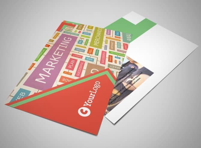
Let’s get right to it:
A clear, bold headline
The front of your postcard should contain one central, unmistakable message. The headline should be big, bold, and quickly tell your prospects what you’re offering and how it will improve their lives.
A graphic that supports the message
The main image should help the headline get its message across. For example, if you’re a Realtor trying to get people to list their homes with you, a home with a “sold” sign in front gets the point across quickly.
Color that pops

Make the most important parts of your postcard — like the headline and call to action (more on that in a moment) — stand out with a color that contrasts with the background. Look at your card. What is the first thing you notice? It should be the headline!
A subhead that leads into text
People like to skim text before they decide whether or not to invest their time reading it. Start the copy on the back of your postcard with a small headline (a subhead) that tells recipients what it’s about.
Benefits, benefits, benefits
Stating features, rather than benefits, is an incredibly common mistake in advertising. Don’t just tell your prospects what you offer, but how you will solve their problems. “Interest rates as low as 4%!” is a feature. “Save money every month with 4% interest rates!” is a benefit. See the difference?
A valuable offer
Especially if you have a lot of competition in your area, a great marketing offer gives prospects a reason to call YOU. It should be something of value to your prospects but that you can afford to give away — and it should create a sense of urgency with an expiration date or limited supply.
Your company name and logo
While your postcard needs to include your business name and logo, it shouldn’t be so big that it overshadows your offer. Prospects want to know who you are, but they care more about what you can do for them.
A call to action
A call to action tells recipients exactly what to do next. Don’t assume they know! “Call today for more information” or “visit our website” are two common calls to action. Make sure it stands out from the rest of the information on your postcard — putting it in a completely different color from everything else help with this.
Contact information
This should immediately follow your call to action. You don’t want to tell prospects to call you, but then make them hunt for your phone number — they won’t!
A return address
Including a return address on your postcard ensures you’ll get returned mail from the post office, which tells you which addresses on your mailing list need to be updated. (Otherwise, you’re wasting money on postage for mail that never gets delivered!) It also helps increase your credibility with prospects when they know you’re an established business with an actual physical location.
based on an article from pcm
