The below article by Postcard Mania lists 10 principals that can make any mail piece an effective, helping improve your conversion rates.
A picture may be worth a thousand words, but an effective Direct Mail Piece (postcard, letter, flyer) design is worth a thousand prospects!
The design of your postcard is almost as important in eliciting a response as getting a good list – it runs a very close second. Much as in deciding on a list, there are definite rules you should follow when designing a postcard.
Based on what I said earlier about the quantity of mail determining your income, you could literally slap together a postcard on your own printer, send it out consistently, and still make money. However, there is more to direct mail marketing than the bare minimum, and eventually low quality will start to affect your campaign. Since you are reading this book, I take it that you want to know how you can utilize direct mail to really grow your company. And that requires far from the bare minimum.

Do you want your direct mail postcard to end up in the trash with the rest of the unread mail? Studies show an effective direct mail campaign should generally draw a .5 to 1 percent response – but this depends on the industry. The percentage could be more.
Top 10 Direct Mail Piece Design Elements
Below, we listed the top ten elements or focal points, which your direct mail piece design must absolutely include and adhere by in order to maximize your return on the Direct Mail Campaign investment.
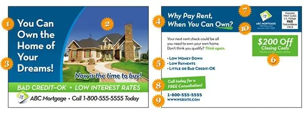
NOTE – At the bottom of the post, after the 10 elements are listed you’ll find a snapshot of a sample piece with the elements placements highlighted, so you can easily see how each element fits in the “big picture” of the whole piece.
#1 – A clear, bold headline
On the postcard there should be one central message. The best way to achieve that is with a bold, clear headline that isn’t cluttered up with other text. The headline should allow the recipient to immediately know what you’re selling.
#2 – A graphic that supports the message
The graphic should be easy to understand and add to the message the headline is conveying. For instance, if you are trying to get people to list their home, you would want to show a home with a SOLD sign clearly visible out front. That graphic reinforces the message more than a plain picture of a home.
#3 – Color that pops
Make the headline and other text stick out by using a color that stands out from the background color. When you look at the card, ask yourself, “What
do I see first?” If it isn’t the headline, you might want to tweak the colors.
#4 – Subheads that lead into text
If you have a couple paragraphs of text with no lead in on the back of your postcard, there’s nothing to entice people to read the copy. A subhead will give prospects a place to start reading. If you have only a hundred words or so, you may be able to get away with it, but if the text gets any longer the average reader will need some guideposts along the way.
#5 – Benefits, benefits, benefits
One of the biggest errors people make in advertising is stating features, rather than benefits. For example, never assume recipients know what benefit can be derived from a lower interest rate on their mortgage. Instead, let them know their monthly payments will go down.
#6 – The offer
An offer is always a good idea and should represent a specific reason to call NOW, such as “Limited supply” or “Interest rates are climbing,” or “Save $50 before the end of the month.”
#7 – Your company name and logo
Although this needs to be on the mailer, it shouldn’t overshadow the offer. Customers care most about what you can do for them – not who you are or how great you say you are.
#8 – Call to action
Tell prospects exactly what you want them to do. “Call today for more information” or “See us online” are two of the most common desired actions.
#9 – Contact information
Provide your name, phone number, and web address directly following the call to action. Whatever you ask prospects to do, give them the means to do it – right away.
#10 – Return address
A return address ensures you’ll get returned mail from the post office and communicates you’re an established professional. People feel better knowing the company they’re dealing with has an actual location.

Choosing The Right Mailing List
Why choosing the right mailing list is even talked about here, when we’re focusing on proper Direct Mail piece design?
Because it’s the second most important key to your Direct Mail Campaign’s success and return on investment.
Even the best mail piece will not work unless it is targeting the right people at the right time – meaning – people who are highly likely to need your products and services at the time you mail them that piece.
This is where we can help you (while helping design the perfect mail piece – we have expert in that subject).
Contact us at today (see? there’s a Call to Action for ya) and let us show you proven results of how some of our customers are making a killing with affordable campaigns, getting new customers weekly, using our New Homeowners Mailing Lists, New Business Mailing Lists and New Movers Mailing Lists.

We are here to serve you and would like to hear from you soon.
Thank you for taking the time to read this post.


